Eye Motion Stop
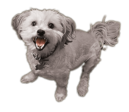
This piece required matching the dog elements in a way that balanced each other while capturing attention. Significant care was taken to find two images that communicated the color messaging while appearing visually appealing on the page. A white dog with the correct pose was never identified so I took a picture of a neighbor’s dog and it worked.
Challenge
A known best practice in eye-motion studies is to create shapes that are not circle or square. The goal here was to stop the reader from proceeding even if for an extra moment by dividing the page diagonally. The messaging goal was to visually represent a broad boundary of the full product line based on animal color.
- Disruption. Visually disrupt the viewer’s expectation of symmetry and balance.
- Eye Motion. Once attention is gained the next challenge is to present all of the product information in a way that keeps the eye moving.
- Broad Messaging. Implied in the presentation of a product for black dogs and a product for white dogs is a reference to the company’s full product line.
Solution & Impact
Results
Pulling the logos out of the company’s graphic archives and enhancing their size allowed them to dominate this creative’s messaging. Analytics showed increased month-over-month conversions for these two highlighted products.
Logo Update from Old Art
The Alpha White shampoo logo was too thin and two-dimensional as it was dated from the early 2000s. (Double K has been in business since 1986.) Getting the correct look took multiple iterations to arrive at the final result.


Traffic on the internet has always lacked attention span. Unless you analyze visitors, prospects, suspects and all forms of client engagement you could be wasting marketing dollars that often simple fixes can correct.
Contact Us
- We never sell or share email addresses.
- Stays on same page.


